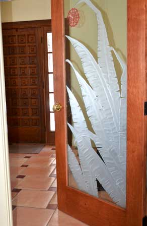
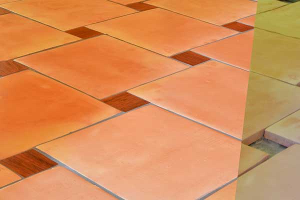
This is a shot of the foyer floor we did in 2012- before and after grout. Mexican tiles, by design, are irregular both in shape and color. The color variation was fine with me, but the shape created a nightmare that only our builder and tile people could resolve.
I’d seen a floor, taken a photo, forgot where I saw it, but knew the pattern was one I liked, and that I wanted the large Mexican tiles. The floor I’d seen had large grey flagstone tiles and small wooden tiles inset. I then turned to the builder (Lance), and asked him about wood and how we could make it work. He happened to have some Brazilian cherry and we were off and running. The person (Andrea) whose job it became to realize my idea, identified the pattern, and drew it out to what would work in the space, then turned it over to Mike (the tile guy).
Once Mike had the tile laid where we wanted it, in the pattern we wanted to achieve, he then measured EACH wood tile opening, and assigned it a number. Lance showed up a few weeks later with a small box full of cut-to-size, labeled and finished wood tiles, each with its own place on the floor for Mike to install. We love it and always will. Here’s a peak…
Recently, I’ve been looking at Pantone colors projected for Spring 2015- as put forward for NY Fashion Week. It’s a little challenging, maybe because the colors are muted and quite pastel- never my favorites- starting with aquamarine, (which I look terrible in).
Two things came to mind. One is that the colors are pretty much colors I’ve always associated with spring. I like them and am grateful for any color after weeks of ice, snow and grey, but I’m always itching for the hot summer colors to come. What’s really new here? You decide. http://www.pantone.com/pages/fcr/?season=spring&year=2015
Second, it’s pretty clear also, that many people consider colors now to be “season-less”, do what you want, when you want it, and follow what you like. Yeah, I knew that.
There are some things I learned in the process of doing our house I’d like to share. Be practical and follow your gut. We picked our builder by word of mouth, we had never seen a totally completed job, but at the conclusion of the process, we’d pick him again ten times over for his honesty, creativity, and craft. Ask your builder who he works with and recommends. Interview them first before anyone else-use them if you can.
Lance identified the tile man who was not only phenomenal in terms of work ethic and craft, he was so obsessive (Mike, I know you won’t take this wrong-it’s a compliment), that you could not go wrong – his pencil perched over his ear-recalculating repeatedly and adjusting as he considered what was evolving in front of him- a work of art in progress. Andrea, the creative soul behind Mike, was amazing in her selection of colors and materials- informed from what I brought her of work unfolding in the rest of the house. Mike had identified Andrea as someone he thought was a good fit for us.
Choose materials and colors that you love, that make you happy. Consider them carefully, over time to make sure you’ll love them tomorrow. We really do love our house- thanks to the local craftspeople we had the pleasure of working with.
We live in the northwest corner of Connecticut. If you’re planning a home renovation project in this area, email me (mary@paolaprints.com) for references, (there were others not mentioned here) or go direct to the following people: Lance Loomis, Builder-Loomis Creative Woodworks in Morris, CT; Michael DeMartino, Northwest Marble & Tile, in Bethlehem, CT; Andrea Brewster, at Tile Spaces in Woodbury, CT and Hitchy at Hitchy Rahilly Interiors, Northfield CT.
Carole King and James Taylor have performed together for many years. This familiar song was a catalyst in writing this post- Will You Still Love Me Tomorrow? Great partnership. http://youtu.be/bNCCtkqhj-g
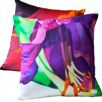
One more thing. Along the way, I was hammered repeatedly by my husband and Hitchy to keep my ideas simple, and use neutral colors. We made the entire common area a light colored bamboo floor which has been an amazing backdrop for intense colors elsewhere. You always need a balance of colors to keep peace. (One pretty one -and Hitchy’s fave-Philadelphia Cream, became a staple) Enter hot-colored decorative pillows..
 If you haven’t subscribed yet, do! We’ll keep you up to date on our pillow launch, and look forward to hearing from you. https://paolaprints.com/subscribe/
Any questions?


Leave a Reply