This is the second year I’ve attended PremiereVision New York, a two-day event held on one of the Piers. It’s completely enclosed, so you’d never know the water was on both sides. It’s billed as the “global textile event for North American fashion professionals.”
There are aisles of exhibitors selling surface design, fabrics and accessories to many companies looking to catch the design wave for the next season. PremiereVision is headquartered in Paris; the event is co-sponsored by an Italian trade group this year, a printing press company from Israel and others. The international mix is appealing. There was a large Japanese exhibitor demonstrating the incredible seamless fabrics their knitting machines produce.
Full disclosure: Pink is not hot. Ha!
My main interest is the seminars, held by different trending companies who whip up their best guesses at what consumers want- from style, fabric and design perspectives. They show colors and patterns expected to be hot.
Collectively, we’re told that that color palettes will remain on the muted side and light colors are achieved through white rather than yellow- that leads to cooler tones. Dark hues are quiet and on the dull side. Khaki and darker khaki, plum and darker plum, muted rust and darker muted rust? If you combine this with a mandate to reach across the gender aisle toward more universally mannish styling, it can get boring fast. Is skin the only way to show the girly side? IF the fabric is wonderful and the cut fabulous, it can be a world of difference. The goods, the design and the craftsmanship are critical differentiators. But that’s always true, right?
In general, I was somewhat disappointed. I think there’s a lot of design confusion out there. Combinations of old faithfuls updated by smashing them together. Plaids in wild colors, different- colored camo prints overlaid with flowers, stripes and patterns that run together without much logic at times. I love mixing it up as much as the next person. But I still believe in rules of design sensibility- things that separate art greats from the self- indulgent.
On a lighter note, my favorite presenter Sharon Graubard, was back again spinning her colorful tales of fashion emerging from the pulse of people-as varied as we all are. Sharon talks about fashion as “self made visible ” and I love that. Get it together, love yourself and good things will show up on your body.
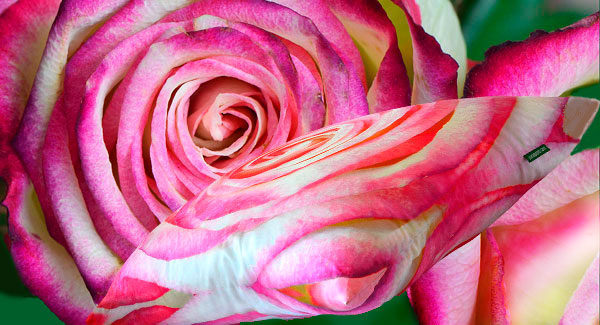
My name is Mary and I’m a sun-aholic. I CRAVE the outdoors, food, parties and COLOR 24/7. It is only through my business persona that I’ve been able to reign myself in. How am I doing so far? How can I be expected to be subdued when so much of what grabs me outside are the wild hues of purple and blue?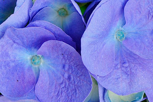
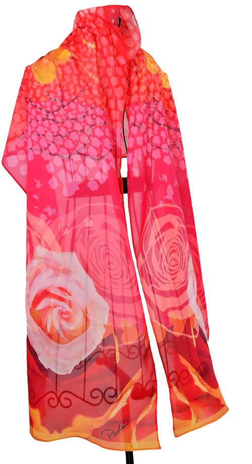
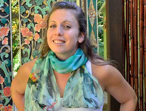
Speaking of self made visible, you have to love this woman- for the continuous unabashed display of her self in color.
http://youtu.be/fYD7CzdPPN0
Leave a Reply