I really can’t get enough. Especially in winter. It’s white everywhere!
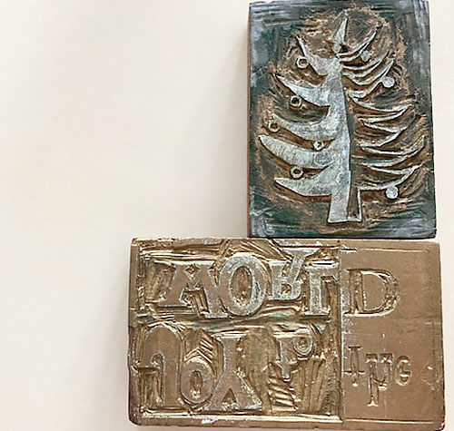
Color rich experiences have been an integral part of my life from, well, forever. As children, before we bought bags of Valentine cards at the drug store, we were charged with creating mad quantities of pink, red and lace cards for classmates on the kitchen table. For Christmas, we hand cut linoleum block prints that we printed and made into holiday cards that we’d then trot out to neighbors to sell. Colored paper, colored inks, textures and glue. Craft heaven!
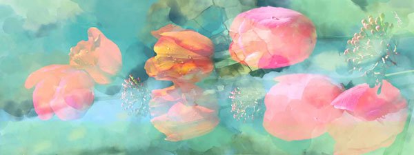
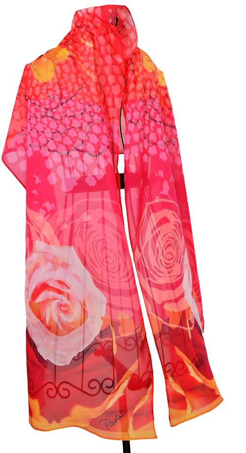
I’m waiting on the return of a test print for a new commission just finished for a high school reunion coming up in a couple months. A fun way to get back into scarf design for Spring. Sorry, this one is only available to my Sacred Heart sisters from Stone Ridge, Bethesda, Maryland. Our colors: blue and gold.

The Pantone Matching System
Pantone, LLC, was the outgrowth of a family owned commercial printing business founded in the 1950s. When the print shop fell on hard times, a part -time employee bought the company out of bankruptcy after systematizing the company’s production of print colors. Today, the company is best known for its Pantone Matching System (PMS), a standardized color reproduction system used across the design industry.
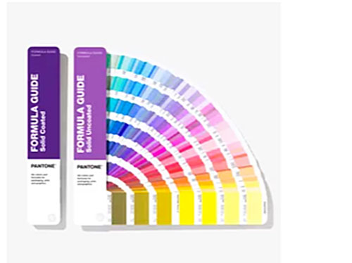
The Pantone Matching System is used all over the world and across media, in fashion and design disciplines. It allows designers to “color match” specific colors in the design phase and monitor accuracy throughout the production process, regardless of how the color is produced.
The Business of Color- The Influencers
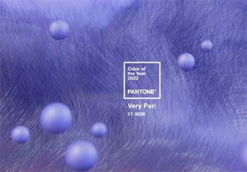
The Pantone Color Institute, a division of Pantone, llc, highlights top seasonal runway colors, forecasts global color trends, and advises companies on color for product and brand visual identity. They incorporate seasonal trend forecasts, color psychology, and color consulting. Part of this program includes annually choosing a “color of the year.”
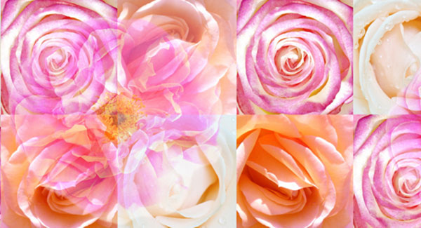
Since I design almost exclusively with my photographs, the resulting artwork is printed as process color using a dot system. Digital creative work in Photoshop and Fresco is much more akin to mixing colors by hand -controlling flow and intensity of color. This is different from using spot color (Pantone colors) and when printed uses four or more standard ink colors ( cyan, magenta, yellow and black) with very fine screens so that thousands of colors are created. Process color is used for printing paintings and very complex colored images.
Feeding the Artist
Winter cold and snow offer this gardener quality reading time- which, includes escapist reading -murder mysteries and travels to various European countries. As a child, I inhaled fairytales in every season. And those stories invariably included romance. You might enjoy this one. The Three Feathers.
I enjoy both reading and watching stories set in the western Europe- the outdoor and architectural mages are very inspirational. Sadly, we’ve put off traveling to most anywhere this year, due to COVID. Hopefully, COVID will pass for most of us soon! I’m grateful to create using photos and imagination. How are you invigorating your own creative life? I hope you can find your own happy space that also motivates.
Fair planning is finally underway. I’m still working toward online selling- very slow out of the gate. You can buy either using Venmo or credit cards. Check out what’s in stock right now- one week away from delivery.
Leave a Reply