As the holidays draw closer, the New England landscape adopts a very subdued color profile- all things tan and brown. The addition of grey skies completes the picture, signaling impending snow events.
So what’s a girl to do? Reach for the twinkle lights, gold and indoor splashes of color of course. When my son lived in LA, it always seemed odd to see holiday decor against a backdrop of radiant sun and blue water. I’m happy to have an excuse in the northeast. All that glitters inside offers a balance that offsets the neutral out-of-doors. (This year, I also put a couple fir trees in the middle of the bare branch azaleas and I’m already happy to see the green.)
I just read something from Leatrice Eiseman, Executive Director of The Pantone Color Institute, that colors in spring 2016 will “ transport us to a happier, sunnier place where we feel free to express a wittier version of our real selves.” Thank goodness for that. I can’t say I ever stopped feeling the freedom to be witty though. Each year, The Pantone Color Institute in concert with numerous forecasters pulls together overarching color schemes that form the basis for fashion colors and home décor. The last couple years have marched us firmly in the direction of muted color, lightened with white and minimal yellows. 2016 appears to be heading into a slightly more upbeat direction so I’m happy for that.
Here’s an example. Pantone Color “Peach Echo”.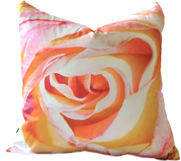 In Paola Pillow world, it’s a rose by the name of Peachy. Eternally pretty, hopefully not saccharin. And Peachy does work well with many other colors. ORDER NOW and you’ll have Paola Pillows for the holidays!
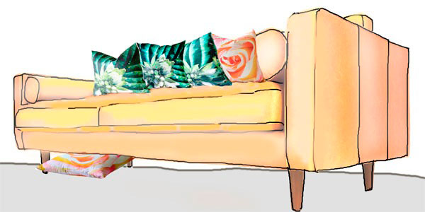
Always go for color that moves you. Colors that fit with you and yours. If you’re curious, see some additional Pantone colors of 2016- here. And, while picking your colors..Enjoy the holidays with friends and family first. A great late night version of Hello by Adele and The Roots.


Leave a Reply