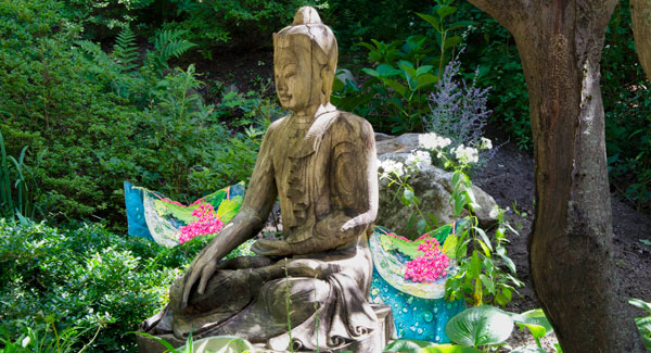
Serenity is something to be strived for. We bought a serenity statue a few years ago in Brimfield MA. Each year we try to get a little farther in making a special place in the garden to secure our own serenity.
I spend a lot of time with each photo, improving and modifying to suit. The photo becomes a fascinating canvas for this artist.
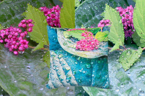
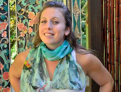
Our statue sits in the shade of an old Japanese maple. Over time, I’ve noticed that sunlight penetrates the foliage behind the statue pretty consistently all day. So, this year, as part of the front garden development, we built up the hill behind the statue and added flowering bushes planted above and behind. So, now in addition to azaleas to its side, Serenity will have Russian sage, phlox, spirea and a blue hydrangea at his back- the better to gaze upon. Of course, Paola Prints Raspberry Hosta pillow fits right into the picture.
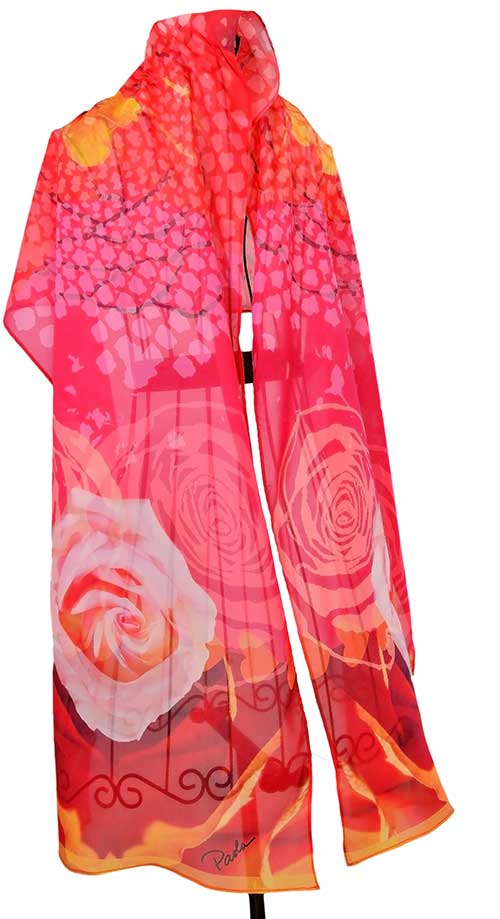
The garden is an integral part of my work as an artist. As I garden, I take inspiration from the colors and light on the flowers. Immediately following inspiration comes the business of organizing. Photos re-imagined in computer software are followed closely by extensive testing with fabric printers to create the desired colors for each design. Then, to figure out construction of the product and what that entails to bring it to market. Of the many photos taken with my Nikon D7000, only a few are re-imagined, fewer still are print tested and produced in limited quantity for sale. A single photo undergoes many changes before it passes muster for print. Witness Raspberry Host (above) – an amalgam of a favorite hosta and its neighboring spirea. Many changes are made to arrive at final art.
Sara Czosnyka works with very different media in her HEX6AGON tiles. There’s a similarity however, in her approach to art and its creative process. 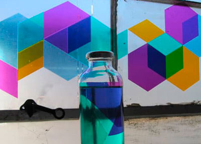 She adds to it the importance of collaboration (and not racing to the bottom in pricing). She says, “I like to be in control of my process and have a tactile relationship with my content, so being able to handle material before and during production is important. I enjoy points of contact with other creatives; people who supply or produce materials I use are creatives. Selecting the lowest price material from a catalog is not creative.”
Colors and light on color have an intense affect on one another. Recently, my daughter was overcome by the weighty decision of choosing colors for her upcoming wedding.
Designing a living space begins with understanding the “givens” which is your “canvas”. Her venue is next to the water. VERY tan, with bright blue sky to compliment it. The existing colors are almost entirely tan and cream. My daughter envisions tropical/seafront colors for her event.
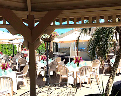
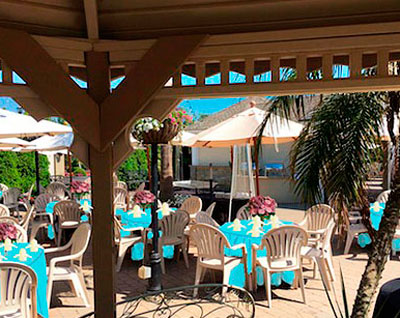 As per usual, I sat at the computer and created some color options to work through with her. Notice how the white vs. aqua tablecloths change the feeling of the space. The good news is we’re starting with a very neutral palette. Classic ( the cream/beige) maybe considered more sophisticated but in comparison, the bright Aqua linen is much more satisfying in the space.
Like the juxtaposition of colors, music can be good, bad or indifferent depending on how individual elements work together. I especially enjoyed this recording of two greats from completely different disciplines performimg together. Stevie Wonder and Luciano Pavarotti. Each has incredible range but somehow they work their voices around each other beautifully- in separate languages no less. Produced in 1998, in Pavarotti’s home town of Modena, Italy- a benefit called “Pavarotti & Friends: For the Children of Liberia. Peace Wanted To Be Free. (Try to look past Pavarotti’s incredible make-up)
Leave a Reply