Holidays Are Here!
December has ushered in a quiet garden and a new holiday season. I love this time of year as thoughts turn to gifts and scheming over festive cooking recipes for family. And, of course, creating new artwork.
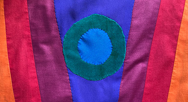
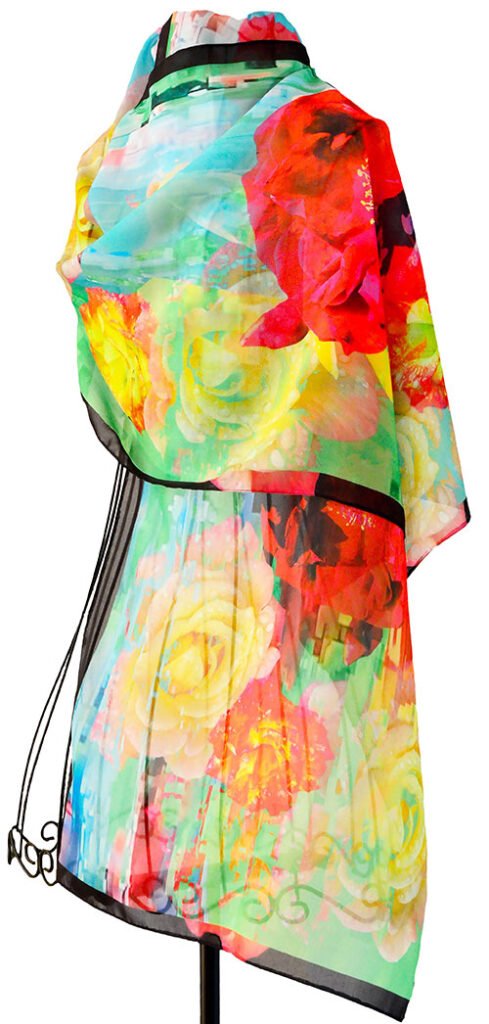
As an artist, my interest in every season stays focussed on color – a driving force behind the need to create. I’m not sure if flowers will always be at the center of my artwork. Flowers are a means to my end of celebrating color. The image at top, is a shirt I made many years ago. Not floral. I am ecstatically focussed on achieving intense color starting with my gardens and translating photographic discoveries (through Photoshop) into clothing and home goods.
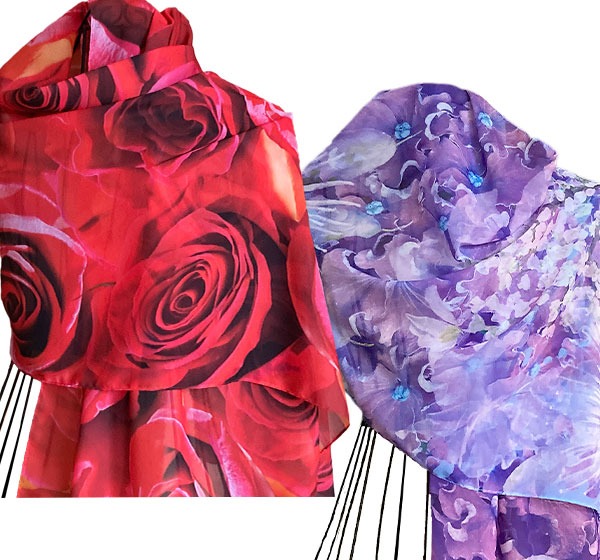
I’ve just completed a commission for some skirt fabric. It required original artwork created at 52“ wide by 72“ long- printed on crêpe de chine- which is a large image to create from scratch. Typically, fabric design is created by setting a small image that gets repeated automatically. That was not the case here, as I prefer to create original material for the entire surface. Nothing repeats. Like a painting. I also had to test how colors would reproduce on the new fabric as I’ve typically been printing on chiffon. I was thrilled to discover how closely colors reproduce on both fabrics. Knowing how the art will look when scaled up to actual size is also important. And yes, I’m loving the opportunity to create more original artwork through commissions. Know anybody looking for original fabric art?
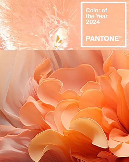
Pantone Color of the Year
I like to keep up with the color chosen by Pantone as color of the year. Although “Peach Fuzz” for 2024, is not NEARLY intense enough, I do enjoy its delicate hue. Peach was always my mother’s favorite rose color. Each year Pantone strives to inform design selections across many categories with its selection.. How do they do that?
Living Color
Color awareness is vital to every human being’s experience. Ever felt blue? Does family every make you feel red at the holiday ( or any day) of the year? Color associations and the significance of them are both universal and historically long standing- regardless of what you do.
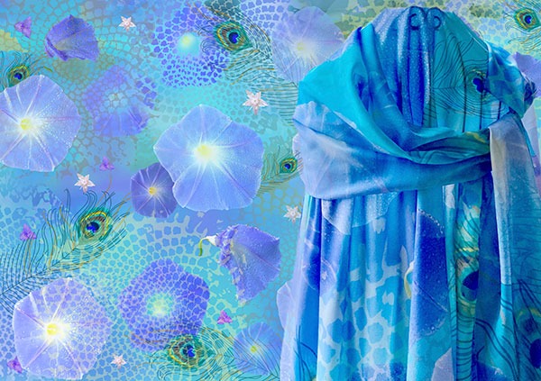
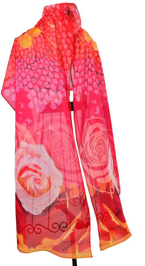
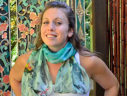
Through color, we feel; we communicate; we remember. Advertisers use color to sell products. Different colors are used in schools and offices to increase productivity or to create a sense of well being, building on the idea that people universally connect certain colors to specific emotions. Correlations are made between colors and memory. For some reason, my Fantasia scarf colors remind me of spring. Don’t we all carry a certain amount of nostalgia around holidays?
Got questions about scarves, pillows, pricing or shipping? Your fastest reply comes when you text me at 203-206-5819. You’ll get my voicemail if you call only- because I don’t cater to robots..and they really like my phone number…OR, you can contact me here.
Leave a Reply