Fashion forward décor has led to the rise of the Color Police in the past few years. Sadly, color has been stamped out from literally every aspect of home décor – walls, window coverings and furniture-even life itself. And no, texture is not a substitute for color.
In 2015, white (the absence of color) was infused into virtually every color -neutralizing it. Also introduced was the juxtaposition of everything “white”. White gloss on white matte, white on off white, white on beige, white on cream. You know what I’m talking about. The simple truth is, we all require some white as background. What nobody needs is a sea of white that quickly takes on an ultra bland life of its own. I mean, where’s the beef???
In 2016, bring color back into your home. If you’re remodeling, look at and read as much as you can about color before you begin. Get a feel for your likes and dislikes. Talk with people you live with, or others whose homes you admire. If you’re working with a decorator, be sure that he or she knows what colors are important to you.
Color is powerful in supporting, creating or changing mood. There’s much written about the meaning of colors, but the ones you choose are essential in creating your unique habitat. Here are some links that might get you started. I’m not selling any single color, only insisting that you not give up your individual colors to please someone else.
Some color psychology
Do you think these are color combinations to be avoided?
Decorating with color and patterns- more is better in my thinking but there are rules to consider.
Kitchen Color Guides– I love red! And more red.
Consider an accent wall. (Better yet, consider a textured accent wall)
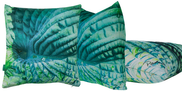
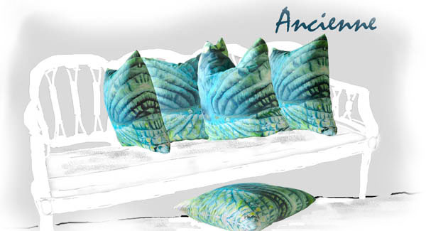
Green, in the form of a highly textured Paola hosta leaf is wonderful in any home, any style.
Living in color reminds me of an old Steve Earle hit, Guitar Town: “I’m smokin’ into Texas with the hammer down.” Remember, you too can live in color.

Leave a Reply